

Ctrl+Z: erros que continuamos repetindo no design de fintech
🔁 Ctrl+Z: erros que continuamos repetindo no design de fintech
“Mova-se rápido e quebre coisas” parecia mais legal antes de começarmos a roubar o dinheiro das pessoas.
🚪 A Fintech prometeu o futuro — mas às vezes entrega 2007
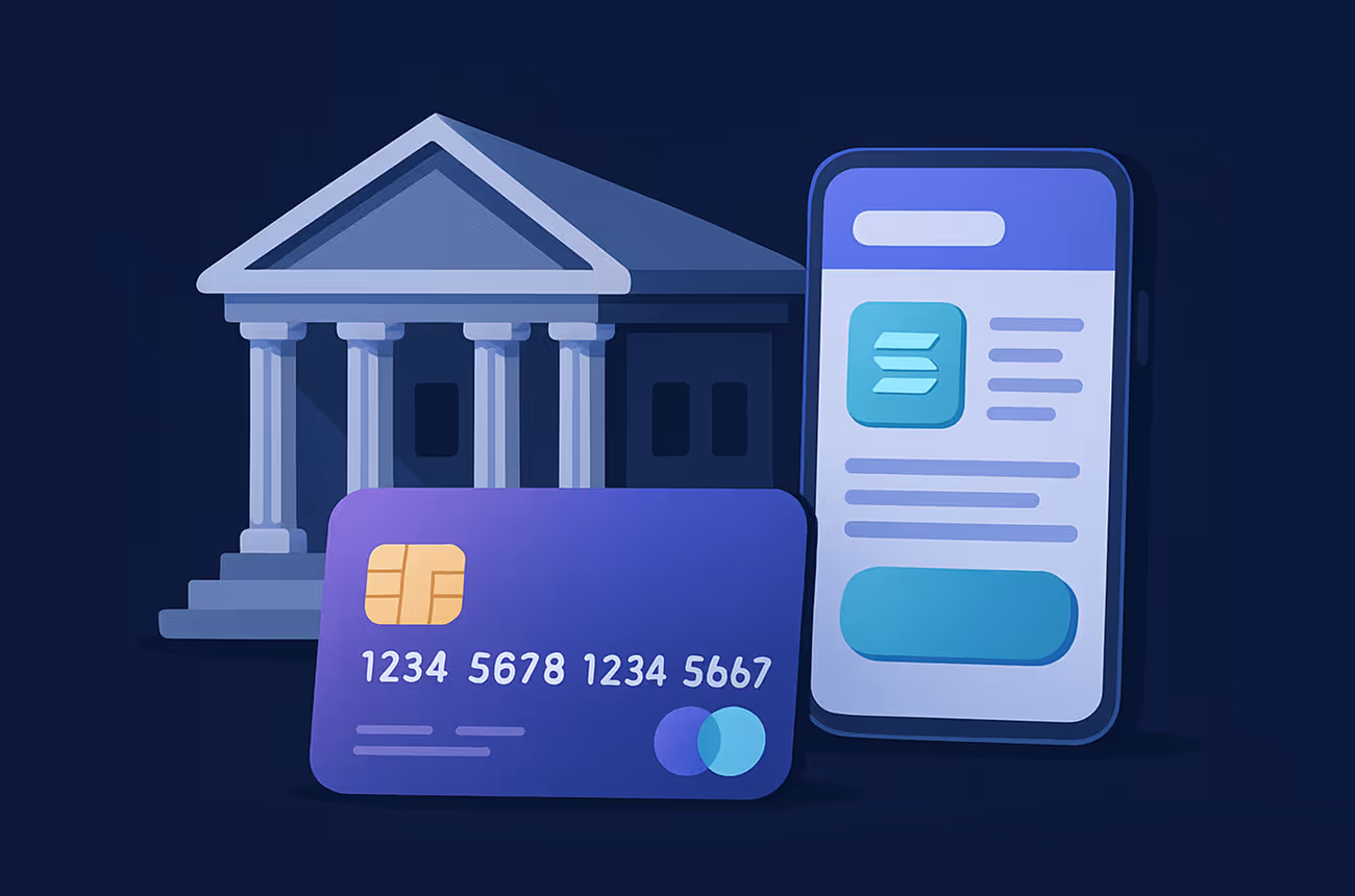
Design em fintech é estranho.
Estamos criando aplicativos para uma economia hiperconectada e em tempo real, mas muitos deles ainda parecem o Windows Vista com um formulário de cartão aparafusado.
Os padrões de UX são reciclados, a integração é complicada demais e até mesmo alguns dos aplicativos mais inteligentes são culpados de esconder a funcionalidade real cinco modais e uma página de configurações confusa.
A pior parte?
Continuamos fazendo as mesmas coisas. De novo e de novo. Vamos bater Ctrl+Z sobre alguns dos maiores pecados do design.
❌ Erro #1: Projetar para conformidade, não para pessoas
Nós entendemos. A fintech é um espaço regulamentado.
Mas projetar um fluxo de KYC como se fosse uma sala de interrogatório do governo não conquistará confiança.
- 14 campos na primeira tela
- Três uploads de ID
- Um botão giratório de carregamento que parece estar repensando suas escolhas de vida
💡 Correção: Projete fluxos KYC com divulgação progressiva.
Explique por que você está perguntando, mostre progresso e não se sobrecarregue.
🔒 Erro #2: Teatro de segurança em vez de UX real
Fazer com que os usuários digitem novamente a senha, depois o 2FA, confirme um link de e-mail e... resolva um CAPTCHA com sinais de trânsito embaçados não é “seguro” — é hostil.
Sim, queremos aplicativos seguros. Mas uma boa experiência de usuário e segurança não são inimigos.
💡 Correção: Use biometria, autenticação baseada em dispositivo e recurso alternativo inteligente. Torne a segurança invisível — não dolorosa.
🗺️ Erro #3: Sem integração = Sem chance
“Descubra você mesmo” não é um princípio de design.
Muitos aplicativos de fintech colocam os usuários em uma interface complexa com contexto zero.
- Nenhuma explicação sobre os tipos de conta
- Nenhuma demonstração de como as transações funcionam
- Sem turnê. Sem dica de ferramenta. Sem amor.
💡 Correção: Trate a integração como uma narrativa de produto.
Ajude os usuários a sentirem esperta, não está confuso.
📉 Erro #4: Tratar a UX como se fosse “apenas UI”
Os botões não são UX. As cores não são estratégia.
Os produtos Fintech geralmente projetam demais a superfície, enquanto negligenciando fluxos, lógica e ciclos de feedback.
Você pode ter o modo escuro mais elegante do mundo, mas se forem necessárias 6 etapas para enviar dinheiro, seu aplicativo ainda é uma porcaria.
💡 Correção: UX = empatia + interação. Retroceda a partir da ação que você deseja que o usuário conclua.
🧮 Erro #5: Nenhum teste real — apenas a lógica do fundador
O CEO gostou. Os investidores acenaram com a cabeça. Os desenvolvedores o enviaram.
Ninguém perguntou: Isso faz sentido para uma pessoa real às 7h de uma segunda-feira com 4% de bateria?
💡 Correção: Converse com os usuários. Teste protótipos de baixa fidelidade. Veja pessoas reais falharem e aprenda.
🧠 Por que isso é importante
As pessoas não se lembram dos produtos.
Eles se lembram sentimentos. E quando você está lidando com o dinheiro deles, o atrito parece uma traição.
Se quisermos criar uma fintech na qual as pessoas confiem — e recomendem — precisamos parar de reciclar pecados de design que nunca foram bons para começar.
Menos atrito.
Mais clareza.
E talvez, apenas talvez... um pouco de prazer.
O design da Fintech precisa de seu próprio momento Ctrl+Z.
✅ Reduzir etapas
✅ Explique as decisões
✅ Respeite o tempo
✅ Projete com confiança
✅ E, por favor, teste-o fora do seu escritório
Porque o dinheiro merece uma experiência de usuário melhor do que um formulário governamental com botões de gradiente.
Latest Post


June 27, 2025
Uma visão honesta de por que a experiência do usuário de fintech continua desajeitada em 2025, além de ideias práticas para tornar os pagamentos digitais fáceis, humanos e realmente agradáveis.

July 21, 2025
Explore por que os pagamentos internacionais permanecem lentos em 2025, o que causa atrasos e como as fintechs estão trabalhando para simplificar e acelerar as transações globais.
June 23, 2025
Entenda as principais diferenças entre bancos, PSPs e fintechs — e por que isso é importante para sua empresa.